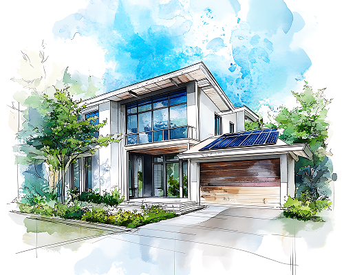
<font size=”4″>こんにちは!受付事務スタッフの穂浪です<img src=”https://tg-houseinhouse.jp/smileys/taurus.gif” style=””></font><div style=””><font size=”4″><br></font></div><div style=””><font size=”4″>友達とIKEAに行ったのがきっかけで最近インテリアに目覚めました<img src=”https://tg-houseinhouse.jp/smileys/chair.gif”></font></div><div style=””><font size=”4″><br></font></div><div style=””><font size=”4″>IKEA本当にすごいですね!一日中見て回れます<img src=”https://tg-houseinhouse.jp/smileys/happy02.gif”><img src=”https://tg-houseinhouse.jp/smileys/shine.gif”></font></div><div style=””><br></div><div style=””><font size=”4″>私のお財布事情の関係で大幅に自分の部屋のインテリアを変えることはできないんですが<img src=”https://tg-houseinhouse.jp/smileys/crying.gif”>、、、</font></div><div style=””><font size=”4″><br></font></div><div style=””><font size=”4″>こうやって興味を持てたのも何かの縁だと思うのでインテリアについていろいろ勉強してみました<img src=”https://tg-houseinhouse.jp/smileys/pencil.gif”></font></div><div style=””><font size=”4″><br></font></div><div style=””><font size=”4″>見て頂けるとうれしいです</font><span style=”font-size: 13.3333px;”><img src=”https://tg-houseinhouse.jp/smileys/happy01.gif”></span></div>

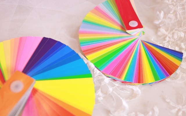
「色」がインテリアを左右する!
<font size=”4″>家具やデザインなどインテリアにとって大事ですが、もっとも重要なポイントは「<font color=”#ff0000″ style=””><b>色</b></font>」です<img src=”https://tg-houseinhouse.jp/smileys/art.gif” style=””></font><div style=””><font size=”4″><br></font><div style=””><font size=”4″>テーマやデザインスタイルを決めていても色がしっかりと決まってないと家具を買う時に同じ色ばかり買ってしまったり、逆に色んな色の家具を買いすぎてごちゃごちゃになったり、、、</font></div><div style=””><font size=”4″><br></font></div><div style=””><font size=”4″>なので家具を買う前にはしっかり色を決めることが大切です</font></div></div>

ベースカラー(70%)
<font size=”4″>メインカラー、ベースカラーを引き立てる脇役的なカラーになります<img src=”https://tg-houseinhouse.jp/smileys/sign01.gif” style=””></font><div style=””><font size=”4″>インテリアで考えると、床や天井、壁などに使われてる色がベースカラーとなります。</font></div><div style=””><font size=”4″><br></font></div><div style=””><font size=”4″>床や天井はそう滅多に変えないと思いますが、もし変えることになったら</font></div><div style=””><font size=”4″>飽きがこない白やブラウン系のような落ち着いた色にすると良いです</font><span style=”font-size: 10pt;”><img src=”https://tg-houseinhouse.jp/smileys/shine.gif” style=”font-size: 10pt;”></span></div>
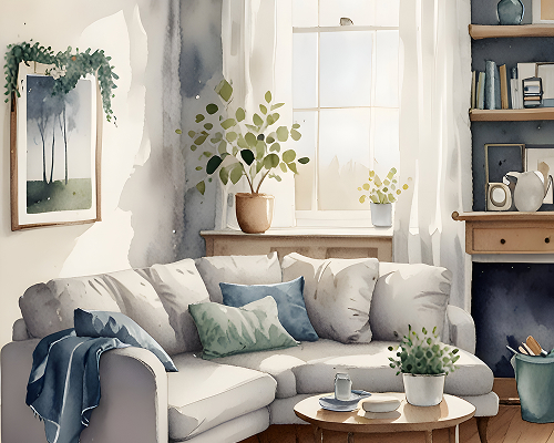
メインカラー(25%)
<font size=”4″>メインカラーは主役となる色のことをを言います<img src=”https://tg-houseinhouse.jp/smileys/crown.gif” style=””></font><div style=””><font size=”4″>カーテンやソファなどの家具に使われる色になります<img src=”https://tg-houseinhouse.jp/smileys/chair.gif” style=””></font></div><div style=””><font size=”4″><br></font></div><div style=””><font size=”4″>基本的には好きな色を選んで頂いて大丈夫です<img src=”https://tg-houseinhouse.jp/smileys/good.gif” style=””></font></div><div style=””><font size=”4″>ですが、主役となる色なので明るすぎず、暗すぎない色を選ぶのがポイントです</font><span style=”font-size: 10pt;”><img src=”https://tg-houseinhouse.jp/smileys/happy01.gif” style=”font-size: 10pt;”></span></div>
アクセントカラー(5%)
<font size=”4″>メインカラーを引き立て、全体を引き締めるのがアクセントカラーです<img src=”https://tg-houseinhouse.jp/smileys/happy01.gif” style=””></font><div style=””><font size=”4″>クッションや小物などで使うことによって一気に印象が変わります<img src=”https://tg-houseinhouse.jp/smileys/shine.gif” style=””></font></div><div style=””><font size=”4″><br></font></div><div style=””><font size=”4″>メインカラーを引き立てる色を使うのがポイントです!</font></div><div style=””><font size=”4″>せっかくのアクセントもメインカラーと似た色を使ってしまうといきてこないです、、、</font></div>
まとめ
<font size=”4″>以上がインテリアで押さえておくべきポイントになります<img src=”https://tg-houseinhouse.jp/smileys/flair.gif”></font><div style=””><font size=”4″><br></font><div style=””><font size=”4″>今回勉強してみて、私の部屋にはアクセントカラーになるものが不足しているので</font></div><div style=””><font size=”4″>クッションか小物の購入を検討してみようと思います<img src=”https://tg-houseinhouse.jp/smileys/notes.gif” style=””></font></div><div style=””><font size=”4″><br></font></div><div style=””><font size=”4″>家具じゃなくてクッション程度なら探せば安く手に入りそうですね<img src=”https://tg-houseinhouse.jp/smileys/coldsweats01.gif” style=””></font></div><div style=””><font size=”4″><br></font><div style=””><font size=”4″>次回は色の組み合わせや色がもたらす効果について紹介していきたいと思います<img src=”https://tg-houseinhouse.jp/smileys/note.gif” style=””></font></div><div style=””><font size=”4″><br></font></div><div><br style=”font-size: 13.3333px;”></div></div></div>