サービス一覧
ティージーについて
施工事例
お客様の声
ショールーム
お知らせ
- service -
窓のリフォーム
玄関のリフォーム
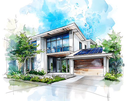
エクステリア
中古エクステリア販売
太陽光発電
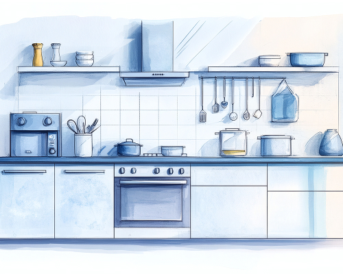
水回りのリフォーム
断熱工事
ペットリフォーム
受付時間 / 8:30~17:30定休日 / 第1・3土曜・日
BLOG & NEWS
リフォームの現場や業務の様子を、スタッフ自身の視点からご紹介します。